THE PACKAGING OF ‘ISLAND’ PRODUCTS DISTRIBUTED BY THE MD SUPERMARKET CHAIN.
THE PACKAGING OF ‘ISLAND’ PRODUCTS DISTRIBUTED BY THE MD SUPERMARKET CHAIN.
BRIEF
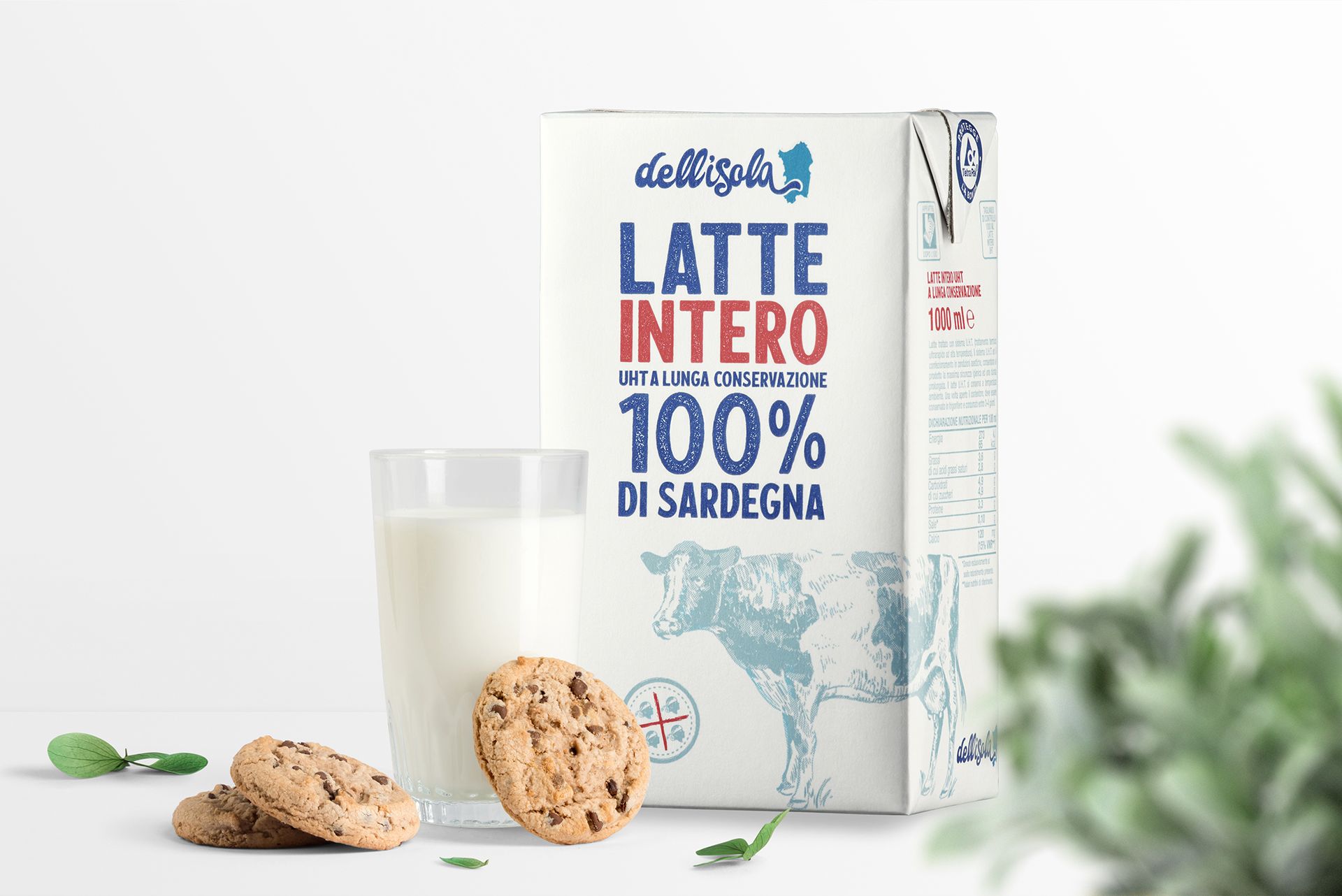
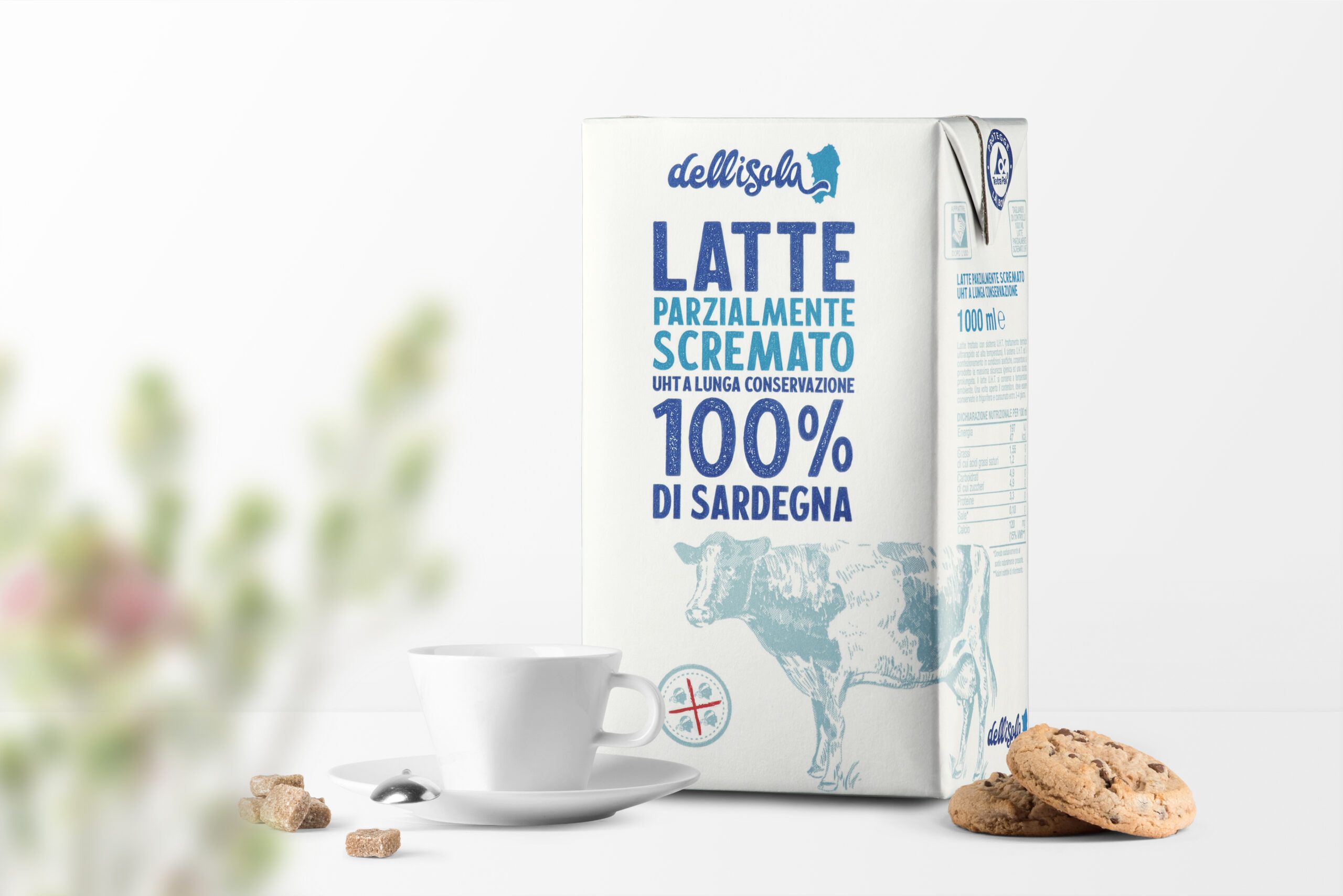
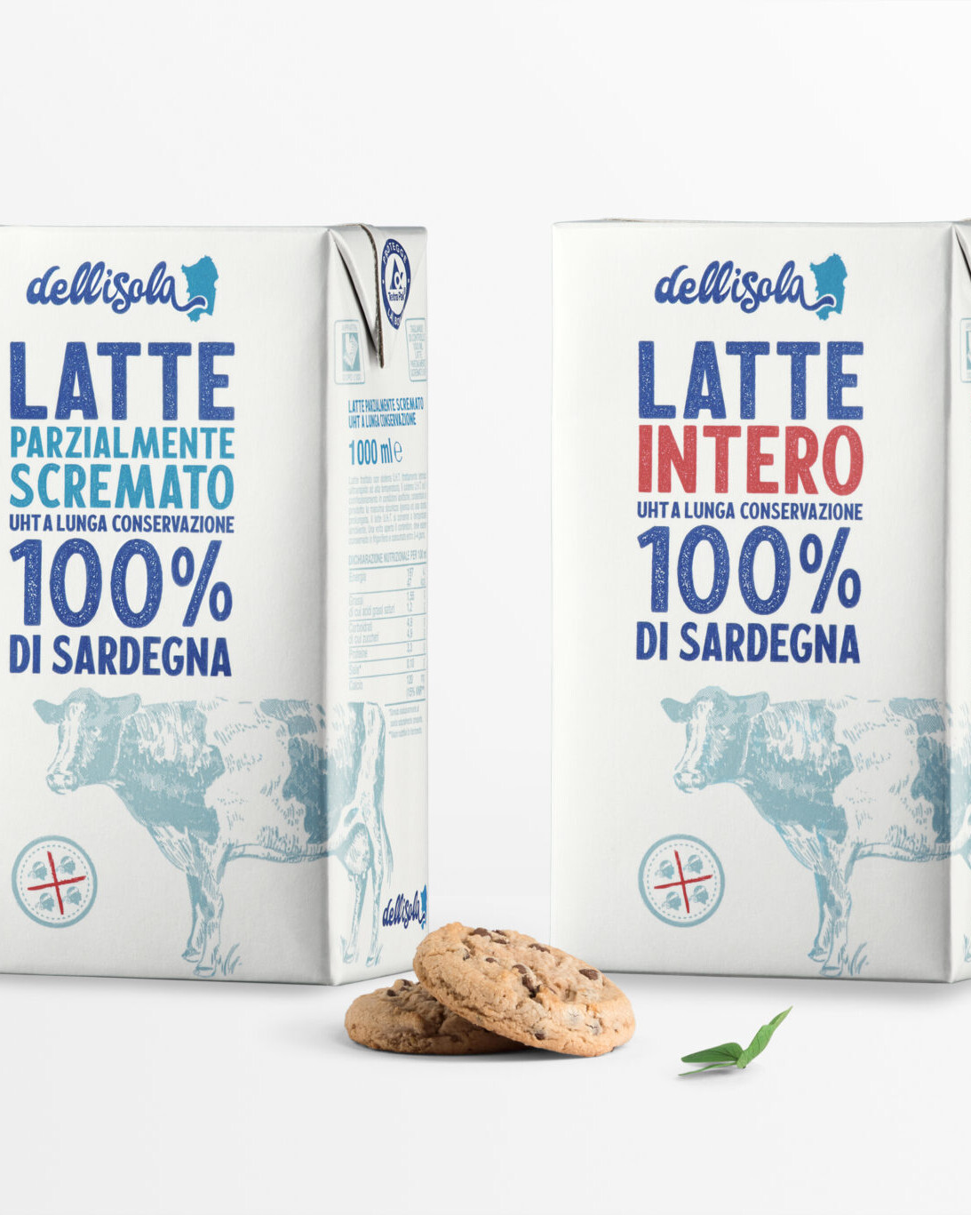
By using clean graphic lines for this packaging line, we wanted to convey the values of authenticity and economy without sacrificing quality.
THE STYLE
We focused on simplicity of shape, legibility of text and a limited use of colours: red, blue and grey. The visual effect is guaranteed by the illustration, the four moors mark (indicating the place of production, Sardinia) and the lettering chosen to favour perfect legibility.
The illustrations, SEDPLUS originals, were done on paper and then transferred digitally with the aid of a graphics tablet.