DOLCESARDO ARBOREA cannot simply be defined as a cheese, it is an icon that embodies the identity of Sardinia. SEDPLUS delivered the restyling of its packaging.
DOLCESARDO ARBOREA cannot simply be defined as a cheese, it is an icon that embodies the identity of Sardinia. SEDPLUS delivered the restyling of its packaging.
BRIEF
ARBOREA wanted to update the image of DOLCESARDO, one of Sardinia’s best-loved cheeses. The goal was not to drastically change the graphic identity, firmly established in the minds of consumers, but nevertheless to modernise the packaging in a way that elevated the perceived quality of the product. Hence the creative decision to take inspiration from the first graphic iterations of the product in order to recount the long history of DOLCESARDO through the new packaging.
STYLE
The new packaging presents clean lines, reminiscent of the classic DOLCESARDO packs (particularly in terms of colour), while highlighting the product’s core values of authenticity and quality.
The original DOLCESARDO packaging featured a series of illustrated faces, each indicating a segment of the product. The cheese could then be divided into portions thanks to the faces on the label. Following several design updates over the years, the number of faces was eventually reduced to just two.
Our idea was to go back to the past, coming up with six new faces that would be representative of the product. The faces were identified following in-depth research, seeking out iconic characters representative of the Sardinian people.
The original SEDPLUS illustrations were drawn on paper and then digitalised with the help of a graphics tablet.
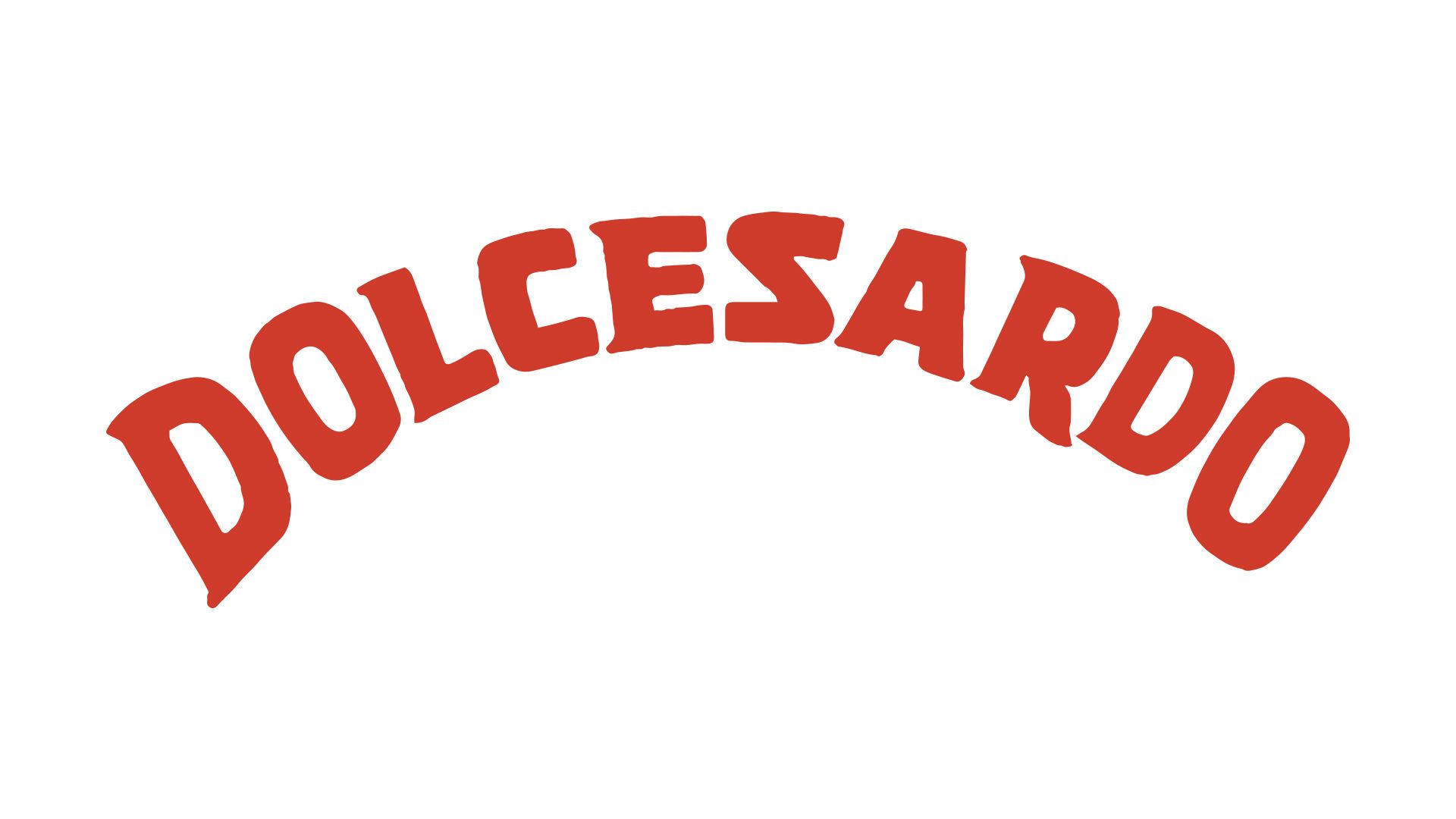
The DOLCESARDO lettering was also redesigned, rendering it more easily readable and contemporary, without straying too far from the existing style.