
THE RESTYLING OF THE BRAND AND PACKAGING OF FANARI CHEESES
THE RESTYLING OF THE BRAND AND PACKAGING OF FANARI CHEESES
BRIEF
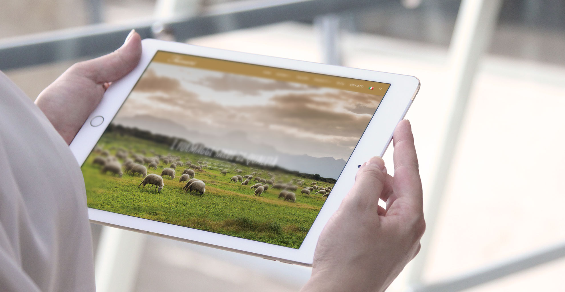
SEDPLUS realised the entire restyling of the image and communication of the Fanari Formaggi dairy: from the logo to the payoff, from the conception of the advertising campaign to the production of the photo shoot, from the writing of all the texts to the realisation of the website.
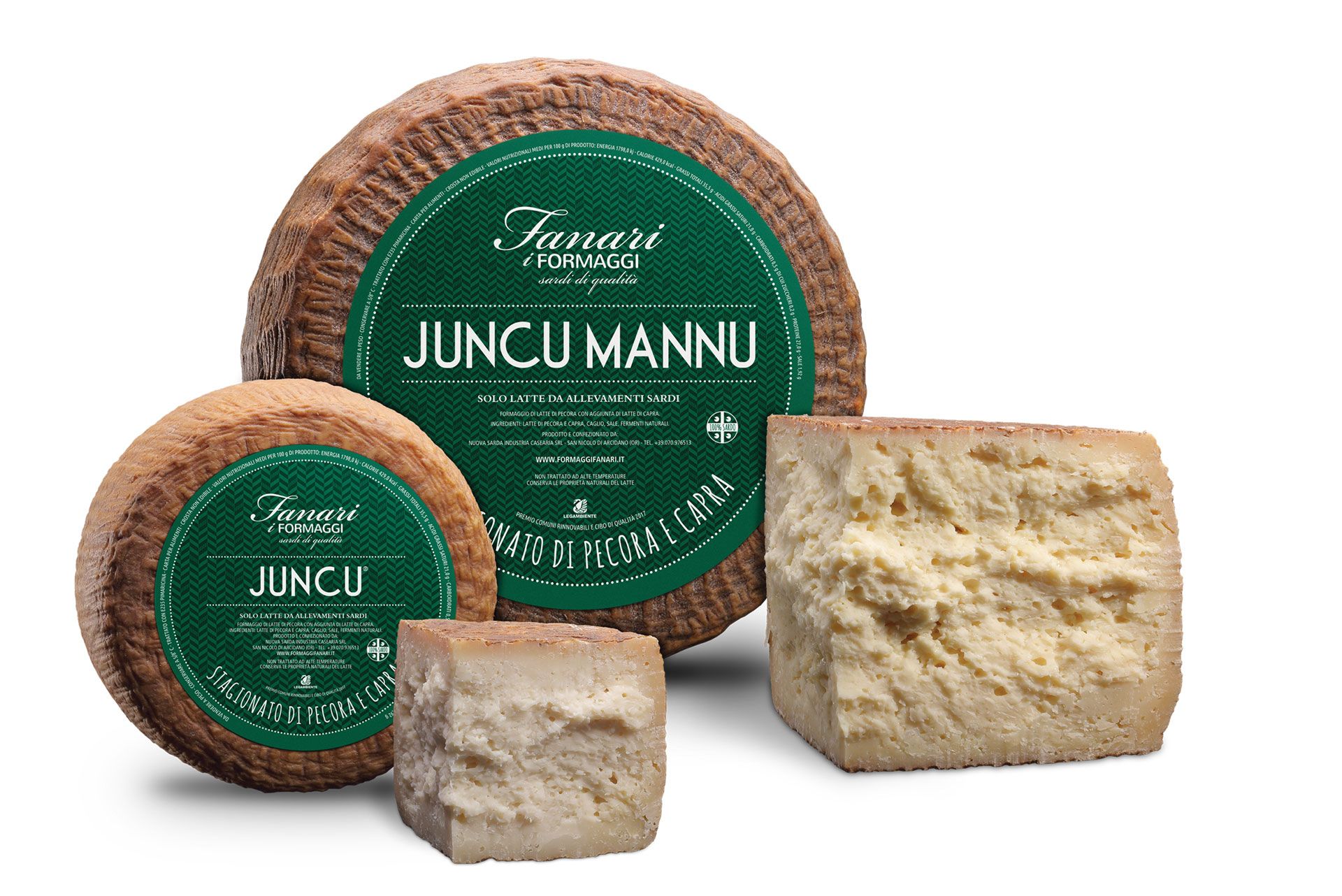
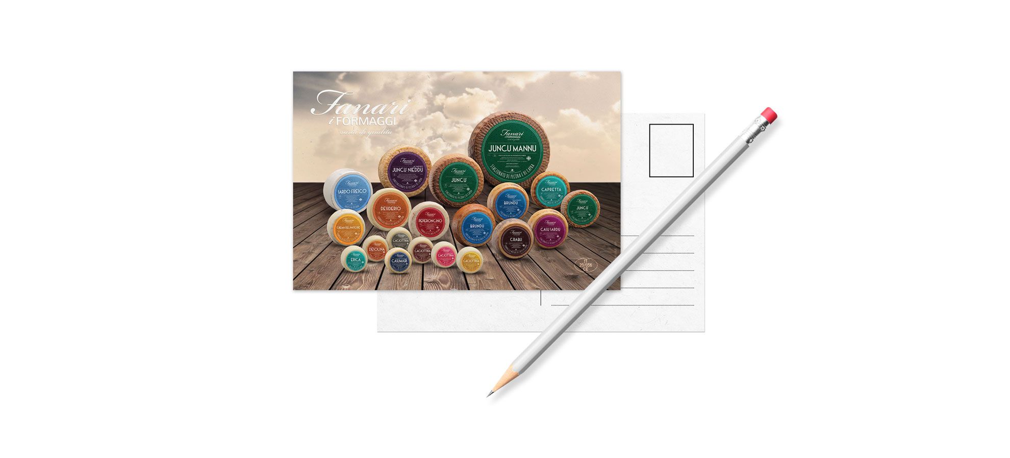
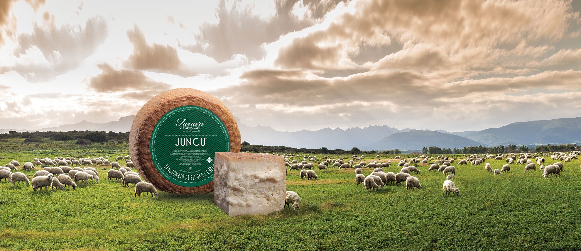
In particular, the restyling of the packaging of the entire Fanari product line is based on one of the main characteristics of the dairy, the production of cheeses whose shape is ensured by the use of rush moulds. These baskets, woven by the increasingly rare artisans capable of making them, have a very short life and must be replaced very frequently. The use of these vegetable baskets gives its name to Fanari’s most iconic cheese, Juncu.
THE STYLE
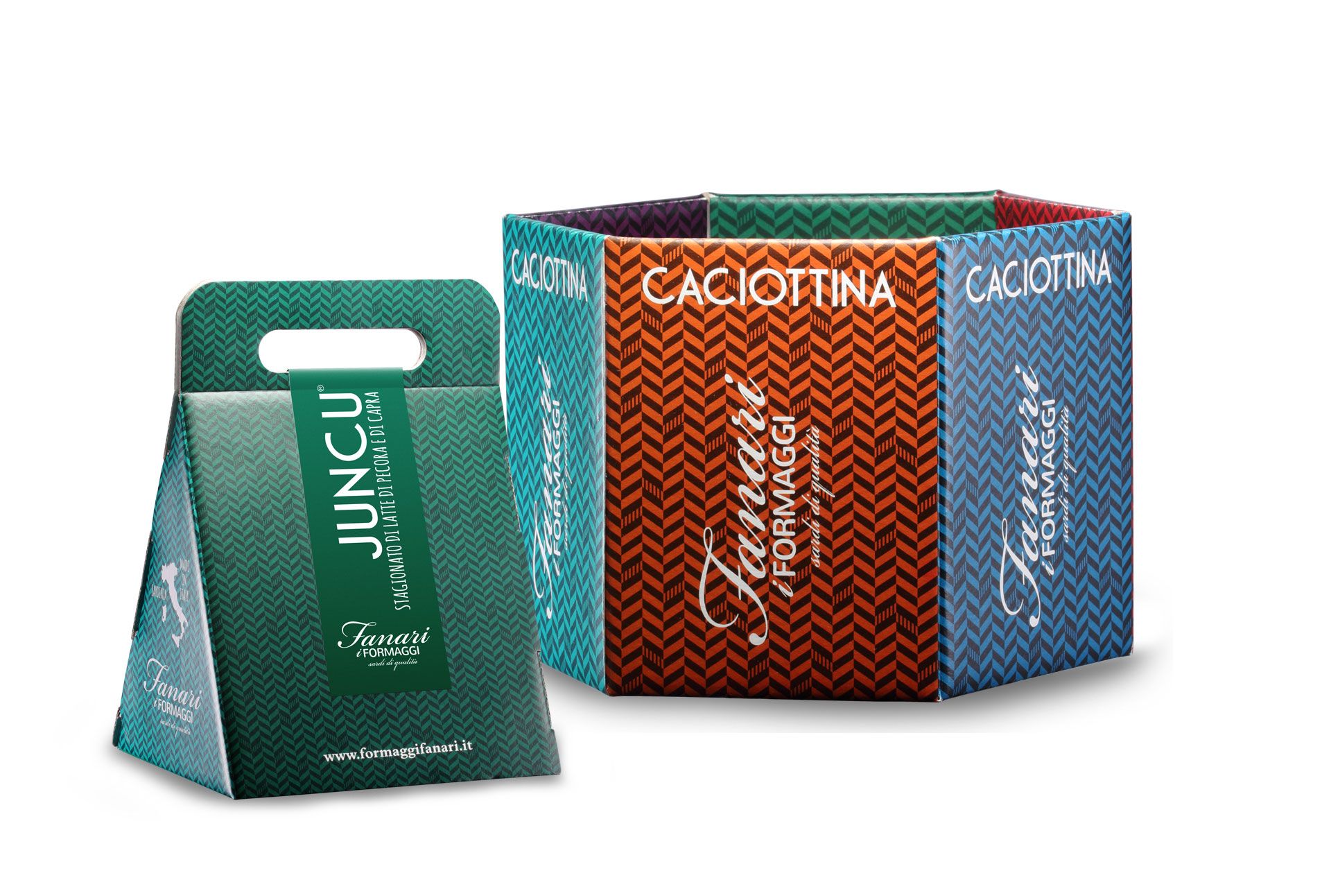
All Fanari Formaggi references have a common graphic line and are differentiated (apart from the name) by colour. We wanted to depart from the clichés associated with Sardinian dairy products by creating colourful, cheerful graphics capable of being noticed and remembered. All the labels (and packaging lines) feature a pattern ideally reminiscent of the weaving of the reed, a fundamental characteristic of the products linked to the brand.
SEDPLUS realised the complete restyling of Fanari Formaggi’s image.