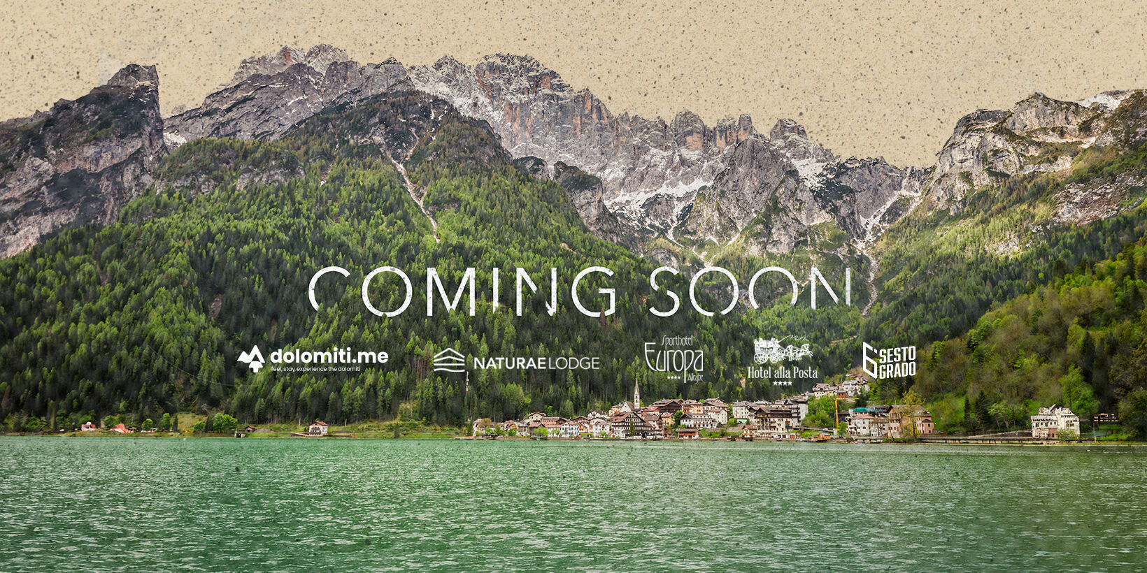
The Dolomites project was born with the aim of projecting a set of accommodation facilities in the heart of the dolomites into the future.
The project
The Pra family, which has been active in the hospitality sector for over 150 years in the heart of the Dolomites, has embarked on an ambitious process of brand transformation. In an era of change and new challenges, it entrusted SEDPLUS with the total renewal of the image and communication of all its structures. Our assignment? To create a modern and coherent identity, capable of narrating the family’s tradition and excellence, projecting it into the future.
A strategic approach
Our work began with a deep analysis of the historical roots and the unique bond that the Pra family has with the Alleghe area and the Dolomites. This allowed us to design a rebranding plan that was not limited to a single structure, but embraced the entire hospitality and catering ecosystem of the family.
So far, we have been responsible for the restyling of Naturae Lodge, a mountain lodge that combines nature and hospitality, and for the creation of the brand and the Dolomiti.me website, a centralised booking platform for all three of the family’s hotels. We are currently working on creating the brand for Sesto Grado, one of the family’s flagship restaurants.
The entire project has been developed to create a modern and coherent brand narrative, conveying a renewed identity and strengthening the competitive position within the reference sector.
Naturaelodge
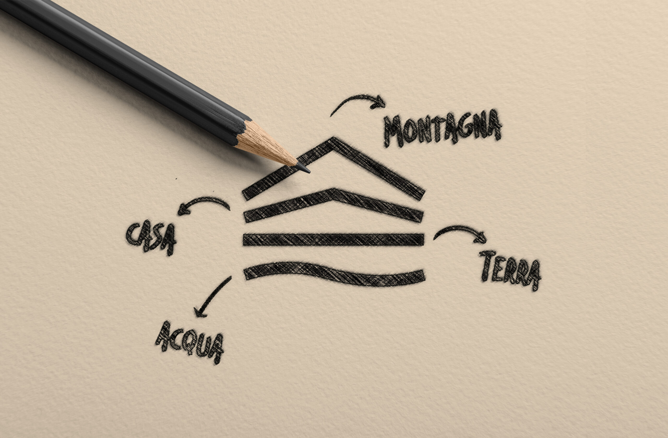
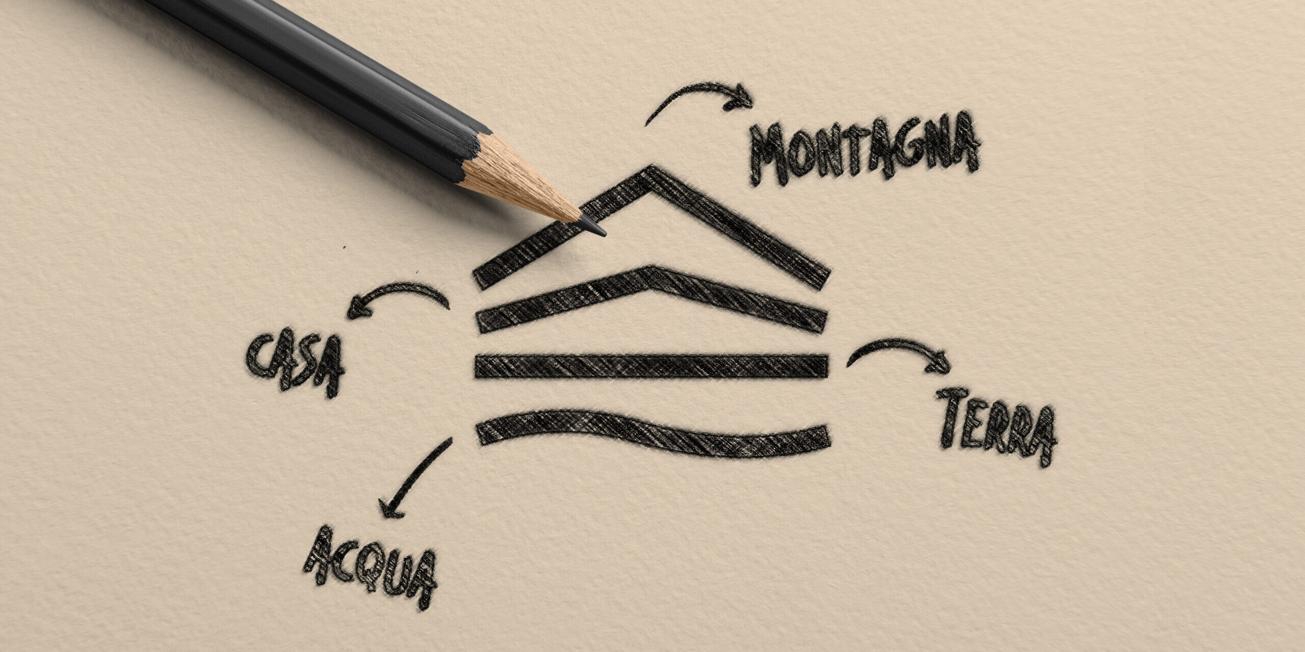
The creative process for NaturaeLodge focused on the visual translation of the natural elements that make the lodge unique. Mountain, home, earth and water were the pillars of our approach. We wove them into a design that not only represents the beauty of the place, but also the hospitality and intimate experience that the hotel offers its guests.
• The mountain, graphically represented with an arrow pointing upwards, to express the power and majesty of the Alpine landscape.• The home, seen as a safe and cosy refuge, the place where one feels at ease after a day’s hiking.• The earth, representing stability and connection to the land, with its paths guiding guests to discover natural beauty.• Water, flowing through streams and lakes, symbolising life and movement, represented by soft, sinuous lines.
The colour palette, based on earthy and natural tones, reinforces the brand’s identity as a place of connection with the surrounding environment. This approach has made it possible to create a solid and coherent visual identity, aimed at improving the perception of the brand on the market and attracting an audience sensitive to sustainable tourism and nature.
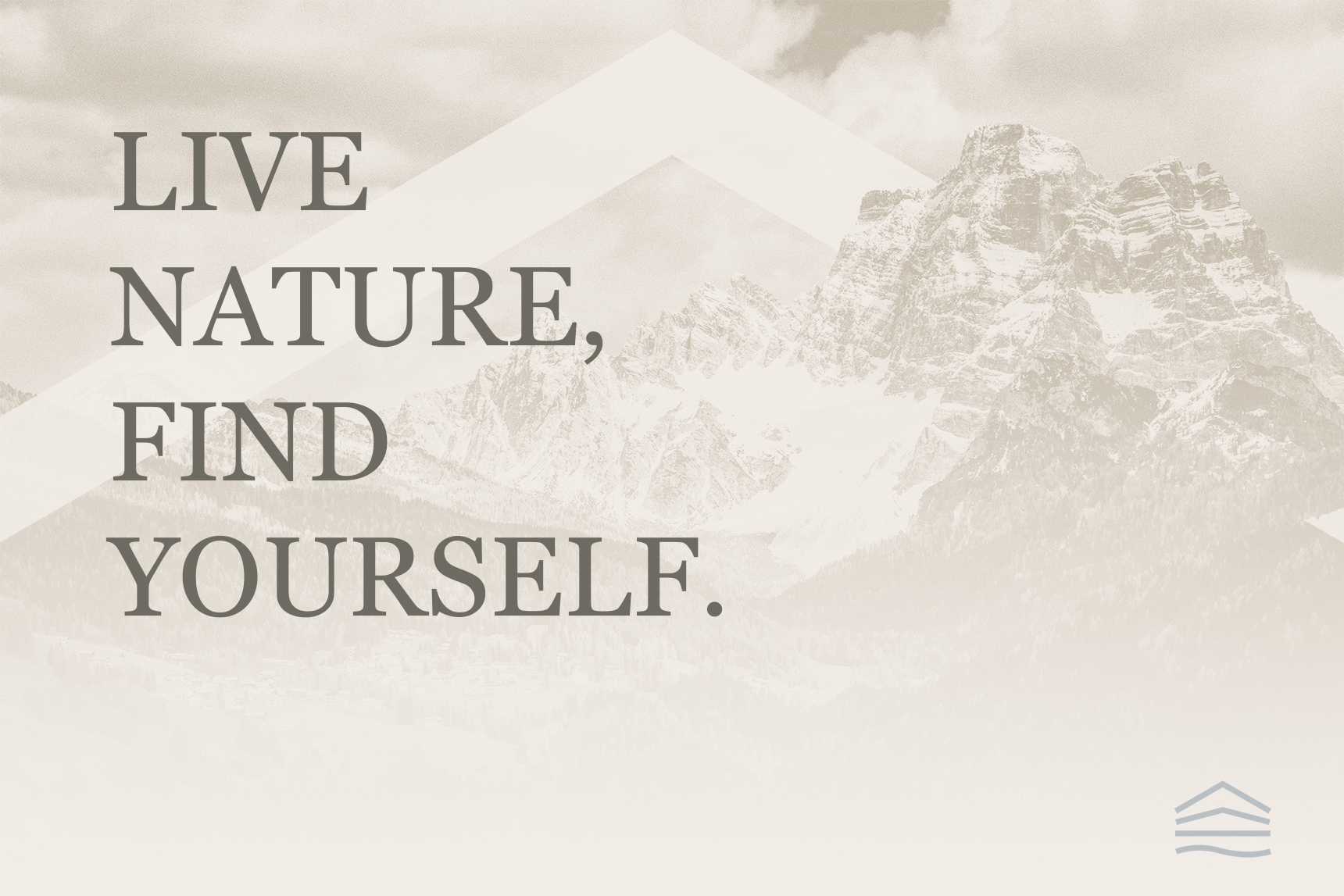
The payoff, Live nature, find yourself, was designed to convey the key message of the NaturaeLodge: experiencing nature means finding yourself.A promise that the brand offers every guest, enhancing the experience of deep connection with the environment.
The dolomiti.me platform
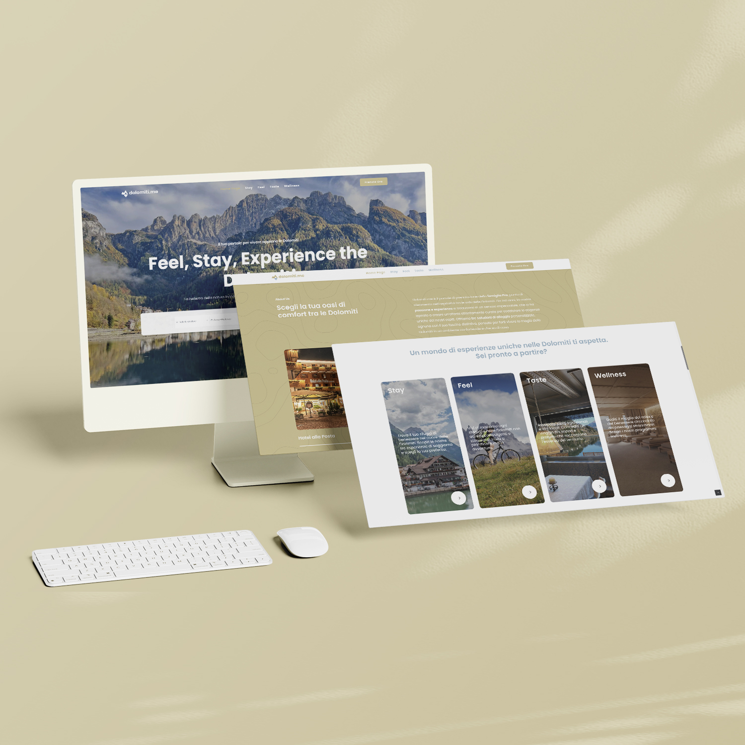
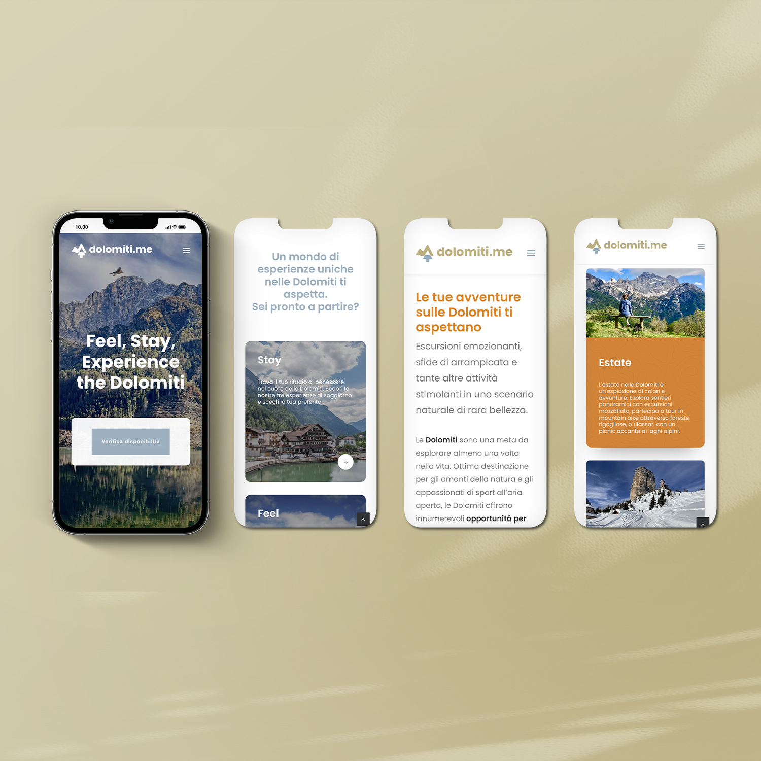
Dolomiti.me is the culmination of the transformation process of the Pra family business. Thus, a centralised digital booking platform for the family’s three hotels was born, offering an integrated experience that facilitates discovery and choice between different accommodation options.
In line with the work done for NaturaeLodge, the visual identity of Dolomiti.me was developed to reflect the strong link with the Dolomites. The key elements of the brand, the mountain, the house, the tree and the water, remain the same but are transformed to ensure a clear visual communication mainly designed for the digital world.
The associated payoff, ‘feel, stay, experience the dolomites ’ underlines the brand’s commitment to offering memorable and authentic experiences, inviting users to explore the area.
The colour palette, using elegant shades of gold and silver, adds a visual coherence that reinforces the premium positioning of Dolomiti.me and its associated facilities, creating a perception of luxury and uniqueness that permeates the entire brand system.
Dolomiti.me plays a strategic role as a digital platform, providing simple and intuitive navigation that allows users to explore the various facilities of the family.